Nicholas Reinholtz
About
Topics

3 Articles

Change a Unit of Measurement and Watch People Magnify Uncertainties
How many cans of beer — or six packs or cases — will your party guests consume?
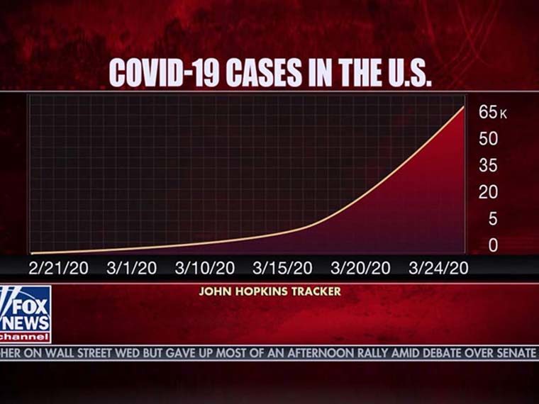
Graphic Presentation of COVID-19 Data Can Skew Perceptions of Risk
Showing cumulative cases — not day-to-day trends — could nudge people to avoid reckless behavior

Lies, Damned Lies and Statistics — and Data Visualization
How we interpret time-series data is dependent on the designer’s chosen format