
6 Articles

Change a Unit of Measurement and Watch People Magnify Uncertainties
How many cans of beer — or six packs or cases — will your party guests consume?

Future-self Nudge Works Even Better in Reverse
Starting with your future self and looking back to your current self increases likelihood of saving
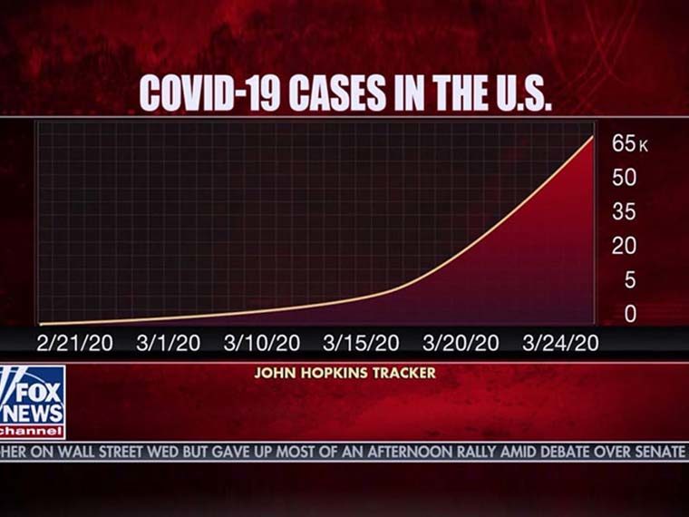
Graphic Presentation of COVID-19 Data Can Skew Perceptions of Risk
Showing cumulative cases — not day-to-day trends — could nudge people to avoid reckless behavior
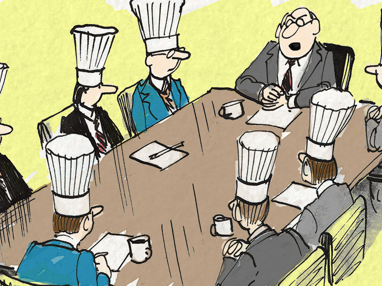
Origin Story of Products: To Consumers, How Big a Team Seems Right?
Buyers value team over individual effort but are sensitive to invention-by-committee

Lies, Damned Lies and Statistics — and Data Visualization
How we interpret time-series data is dependent on the designer’s chosen format